Wednesday, July 29, 2015

Muchas Gracias and Xiè Xiè

Hi friends,
I'm sharing a little note set I created for the teachers in my department as a "Welcome Back to School" gift. From time to time, we usually get little gifts from our students & I know I like to give them a thank you card. I thought I would create a set of 4 note cards so teachers can have them on hand.

Here's the note card holder:
Since we're Spanish teachers, I thought the Papel Picado banners from Avery Elle would be a great set to use.
Here are the cards in each color way:


Since I was making multiples, I needed to keep them simple.

Here are the innies:
There are two cards and envelopes on each side.

And here are all the note card holders:
I stamped the party banners in the same colors. I think it made it look very fun & festive! *Ü*

We also have one Chinese teacher, so I created a little something more fitting for her:
Here's the note card holder:
The background is embossed with the CB Roman Bath embossing folder. I die-cut the Koi fish and the letters to spell xiè xiè.

Here's the card:
Here's the innies & the cards:

Those are the Chinese symbols for "Thank You" from a Stampendous stamp. I had to do some stamp surgery because my friend told me the way it was mounted on the stamp (vertical) wasn't really correct. So I cut it apart & remounted it horizontally. I stamped it with Versamark ink & heat embossed them in gold. The inside says "Thank You" in English, but I forgot to take a pic of that :(

This is a super easy peasy card holder to make that I've been using for years. In the original instructions, you are to use eyelets, but I just use liquid adhesive with no problems. You can find the tute---> HERE.

I hope they like them *Ü*
Thanks for stopping by today.
Until next time!

The 411
Stamps: Papel Picado Banners-Avery Elle. Hooray-Papertrey Ink. Chinese Characters Thanks-Stampendous
Ink: Soft Pool, Tide Pool, Pool, Pale Tomato, Soft Cantaloupe, Butter Bar, Soft Purple, Bubble Gum, Passion Flower-Hero Arts Shadow Inks. Brilliance Platinum Planet. Crumb cake-SU. Versamark ink
Paper: Neenah Solar white cs. Real red, Pretty in Pink, Pool Party, Coastal Cabana, Crisp Cantaloupe, So Saffron, Lilac-SU. True Black-PTI. Gold cs
Tools: Fishtail Flags dies-MFT. Koi die-Cheery Lynn. Modern alpha-PTI. Papel picado banners die- Avery Elle
Other: Ribbon

Sunday, July 26, 2015

Featured Stamper Blog Candy

Hi friends,
I received a note yesterday that I am the Featured Stamper on Splitcoaststampers!
 I was surprised and shocked! I mean...ME??? Did they run out of people, or something? Lol. Well, I am so honored and speechless, quite frankly. And my friends will tell you if you've silenced me into submission, you've really done something amazing! *Ü*

Soooooo, I thought I would offer up some Blog Candy! I mean, it's been a while and I can't think of a better way to say "Thank You!"

I've got some paper, and stamps, and dies- OH MY! and a few other goodies I've put together.
All you need to do is leave a comment on this post. Just one, ok!  Play nicely with others! *Ü*
I'll have my beautiful assistant,
as always, pick a random winner from her bag.

You can leave any comment you'd like, but if you're up for it, why not...
--- Share YOUR good news! Anything we can say Hip! Hip! Hooray! to you for?
--- Share your favorite inspirational quote

As always, you do NOT need to be a follower and all friends are welcomed. Be sure to leave a way for me to be able to contact you, if you're the winner. The winner will be announced here on August 8th, 2015.

Thank you so much for stopping by!
Have a great day!

Thursday, July 23, 2015

NY Luck

Hello friends,
I have a couple of cards to share today.
My bestie's son is leaving California and heading to New York for work. She threw a little going away party for him. Instead of chips & dip, I brought a card :)
I blended Distress Inks to create the starry night background. I used Faded Jeans, Chipped Sapphire, and Salty Ocean. I stamped the city skyline in versafine onyx black. The image is from a Tim Holtz Stamp, I'm not sure if it's NY, but I thought it would go well in the background. I added lots of clear Wink of Stella to the bottom part of the card so it would look like water shimmering in the moonlight.
Here's another peek:
 To finish I added a few drops of Glossy Accents here and there. Very simple card.

My second card, I actually forgot to share. I made it for my neighbor for Father's Day.
Here it is:
 He's an AVID golfer so that's the theme I went with. You know me- I LOVE interactive cards so I had to make a spinner element for that golf ball *Ü*
Here it goes...

A hole in one! So fun!

I'm busy getting ready for a new batch of 200 kiddos and a new school year, but I'll pop in to share as time permits...
Until next time *Ü*

Monday, July 20, 2015

MFT Summer School: Monochromatic

Hello friends,
It's the last day of My Favorite Things Summer School- Session 2.


Today's card is for Lesson #10- Color Theory: Monochromatic
def: Colors that are Monochromatic are of similar saturations and hues with different shades of the same color. In fact, the word monochromatic comes from the Greek word parts mono (meaning “single”) and chromato (meaning “color”). Take a look at the more in depth color chart below — one slice of that pie has multiple shades of the same hue. It all depends on the amount of white or black added to the most saturated color on the outside of the wheel.
 Here's my card using monochromatic colors:
I decided to use the white to black color palette since I needed to make a wedding card for a friend. I die-cut the Alphabet cover-up die in Shimmer White cs, the letters "M R S" again in Shimmer white cs, and one more time in fun foam. I colored the letters using Copic markers in C3, C5, C7. I then die-cut the confetti in different shades of black, gray, and white cardstock using the Layered Heart border die and the Martha Stewart heart confetti punch. I sealed the confetti between two sheets of vellum cs and adhered it to the card base.

Here's another peek:
I added Glossy Accents to the letters and did the same thing to the little heart to match the letters. Last, I stamped "Congratulations" from the Essential Sentiments stamp set with versafine Onyx black ink (stamped off once so it would be a more muted black.)

Here's a peek of the innies:
I took the left over border strips (I used the heart insides as confetti on my card front) and used them to create a little border on the inside *Ü*

That's it for Lesson #10. MFT will be back in August for Session 3 of summer school, but I don't know if I'll be able to play along with all of them because it will be time for this teacher to get back to the classroom again.

Thanks so much, as always, for taking the time to visit and for your sweet comments. I truly appreciate it!
Tootles!


The 411
Stamps: Essential Elements-My Favorite Things
Ink: Versafine Onyx Black. Copic markers
Paper: Shimmer White cs. Vellum cs-SU. various black, white gray cs from my stash
Tools: Alphabet Cover-Up plate- Lil Inker. Layered Heart Border dies-MFT. Hearts confetti punch-Martha Stewart
Other: Glossy Accents-Ranger. Fun foam

Saturday, July 18, 2015

MFT Summer School: Secondary Colors

Hi ya friends,
I'm back with another lesson from My Favorite Things Summer School.
 This is Lesson 9- Color Theory: Secondary Colors
Def: Secondary Colors are the direct counterparts of the primary colors — red, yellow, and blue. Orange (a combination of red and yellow), green (a combination of blue and yellow), and purple (a combination of red and blue) are the secondary colors. You can find them in between their primary colors on the color wheel. 


So using a combination of orange, green and purple, I bring you my card:
I die-cut the cute camera dies several times on white cardstock to create the photo-themed background. I die-cut the Instaframe and blended in the colors randomly behind this little PI girl. When I saw this little girl, it totally reminded me of when some kids take their school picture. They stand really rigid, with their arms at their sides, and a forced smile or none at all! *Ü* Lol! So that's what she looked like to me, which is why I had to add "smile" as the sentiment *Ü*

Here's another peek:
 I die-cut another little camera in the peachy color and added a little heart to the opening.

A closer peek:
 She's colored with the no-line Copic coloring technique.

I used this week's MFT sketch:
 and as well as the colors for the color challenge #25:
The color palette worked great for this lesson! Yay!

That's it for this lesson on secondary colors.
Thanks so much for taking a peek today.
Until next time...have a great weekend!


The 411
Stamps: Pure Innocence Pretty Pumpkin-My Favorite Things
Ink: Milled Lavender, Twisted Citron, Fossilized Amber-Distress Inks. Groovy Guava-SU
Paper: Neenah Solar White cs. Groovy Guava cs, Kiwi Kiss-SU. Shimmer White cs. lavender, daffodil cs
Tools: Cute Cameras dies, Instaframe die, Fishtail Flags dies-MFT. "Smile" die-Mama Elephant. Stitched Rectangle dies-Lawn Fawn. Copics
Other: clear Wink of Stella brush, white gel pen

Friday, July 17, 2015

MFT Summer School: Complementary Colors

Hi there friends,
I have created a card for My Favorite Things Summer School 
 This is Lesson 7- Color Theory: Complementary Colors
Def. Complementary Colors do just what their name suggests — they compliment each other. They are found directly opposite one another on the color wheel.
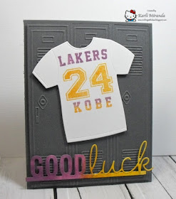
Looking at the color wheel, apart from red and green (Christmas), I don't usually pair up these colors. But I thought I'd try a color duo I haven't really used before. I decided on yellow-violet. I mean if it's good enough for the Los Angeles Lakers...Hey! That's it! And off to get crafty I went *Ü*

Here's my card:
 My youngest son, Jordan, is a BIG Lakers fan (poor kid :(... and no matter how terrible their season is, Jordan still cheers them on. On to the card deets...I embossed the background with a little locker door embossing folder (cute, huh! *Ü*) then I die-cut the T-shirt from white cs and used the stamps from the MFT Jersey & Stamp set dienamics to personalize the shirt. I inked those up with purple & yellow (gold) as well as the "Good Luck" sentiment.

Here's another peek:
I'm hoping to take him to a pre-season game this year (because even though the Lakers haven't been champions lately, their season ticket prices are as if they were!) and pre-season is within my budget! I thought I would enclose his ticket in this card to surprise him *Ü*

Well that's it for my complementary color card. I see a hand up in the back...question? "Am I a Laker fan, too?" Well, I believe in cheering on the home team(s), and since I'm in Southern California, I do cheer on the Lakers, Clippers, and Golden State (LUV you, Steph Curry!!!) But... my heart bleeds the RED and BLACK...I did name my son JORDAN after all! *Ü*

Thanks so much for coming to play on my court.
Have a great weekend!

The 411
Stamps: Jersey Stamp set-My Favorite Things
Ink: Plum Pudding, Summer Sunrise- Papertrey Ink
Paper: Basic Gray cs-SU. Neenah Solar White cs.
Tools: Masculine Graphic T-shirt die-MFT. Accent It-Celebrations "Good Times" die-MFT. Wonderful Words "Lucky"-PTI. School Embossing folders- Darice

Thursday, July 16, 2015

MFT Summer School: Primary Colors

Hi friends,
Today's card continues the lessons from MFT Summer School.

 Today's lesson is #8 Color Theory: Primary colors. def: The most basic of colors are primary colors — red, yellow, and blue. See how they create a triangle in the color wheel? From those three colors come all of the rest.
 Here's my card using the primary colors:
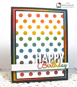
 I luuuved the look of Stephanie Klauck's example on the MFT blog. I wanted to try the technique myself. I used my dots stencil and Distress Inks to blend the colors. So, when I blended red and yellow, that gave me the orange hue. Blue and yellow gave me the green hue. Red and blue gave me the purple hue. I also did the same thing for the border around it (without the stencil.)

Here's another peek:
I added clear Wink of Stella to everything with color on it! It was really hard to not add more to the card, but I decided adding more would cover up the color effect---> which is the whole point of the lesson. So I decided to dec out the innies a bit instead:

I did the same thing to the balloon. Honestly, this color theory is not anything new to me, but it's so much fun to play...and change it up a bit from the usual *Ü* I hardly ever use stencils, but after this, I KNOW I will be playing with them a lot more! Fun, fun, fun! *Ü*

Thanks so much for stopping by *Ü*
Have a colorful, wonderful day!

The 411
Stamps: Birthday Sentiments-My Favorite Things
Ink: Versafine Onyx Black. Distress Inks-Fired Brick, Faded Jeans, Fossilized Amber
Paper: True Black cs-Papertrey Ink. Whisper White cs-SU. Neenah Solar White cs
Tools: Dots stencil-Heidi Swapp. Accent It LLD Celebrate dies-MFT. "Birthday" word die-Impression Obssession. Basic dies set-Mama Elephant. Wonky Stitches dies-Avery Elle. Stitched Rectangle dies, Party Balloons dies-Lawn Fawn
Other: clear Wink of Stella brush

Tuesday, July 14, 2015

Tu-Tu Cute and Summer School

Hello there, friends...
 I'm back today to share a couple of cards for My Favorite Things Summer School Session 2! Yay!
For this lesson, the focus was on the the theory of Gallon/Quart/Pint. Basically, it involves using a tricolor scheme which can make most any card work when applying a main color, a little less of another color, and a smaller dose of a final third color.

I have been wanting to inky up this totally a-do-ra-ble little PI, called Tu Tu Cute *Ü* Lives up to the name, right?! Ok, on to the deets...
In my mind, pink was the gallon, white was the quart, and black was the pint. I colored her with the Copic no-line coloring technique & die-cut her with the coordinating die. Her tu-tu is some Prima ribbon from my stash. *Ü* I added the little paper bow to her hair.

Here's a closer peek:

 Here are the simple innies:

Well, after thinking about it I wasn't sure the rule was totally obvious (WAS there more pink than white???) hmmm...so...I decided to make another, more definitive card. I needed another "Thank You" card so off to crafty work I went!

Here's my second card:
I chose one of my fave color combos (gray, white, yellow.) For this card it goes: Gray-Gallon, White-Quart, Yellow-Pint. I die-cut the fanfare border from Basic Gray cs so that the background wouldn't be so plain. The feathers were die-cut from white glitter paper so they're sparkly! Then I took the scribbles dies & die-cut them out of yellow cs. Last, I white heat embossed the sentiment on Vellum cs.
Here's another peek: hope you can see the sparkle on the feathers.

Here are the innies:

Oh, I almost forgot! I used this week's MFT sketch for my ballerina card.

Thanks so much for twirling with me all the way to the end! *Ü*
Have a wonderful day!


The 411
 Tu-Tu Cute Card
Stamps: TuTu Cute-MFT. Thanks-Simon Says Stamp
Ink: Desert Sand Memento. Copics
Paper: True Black cs-PTI. Pretty in Pink cs-SU. Pink cs-Coordinations. Neenah Solar White cs.
Tools: TuTu Cute die, Stitched Rectangles dies, Stitched Circles dies, Layered Hearts die-MFT. Basic Set dies-Mama Elephant. Tiny Stars Embossing folder-The Paper Studio
Other: Pearls, Viva Decor pen, ribbon(Prima)

You are Wonderful Card
Stamps: Simply Fab Sayings-MFT. Thanks-Simon Says Stamp
Ink: Basic Gray-SU. Versamark w/white embossing powder
Paper: Basic Gray cs-SU. Neenah Solar White cs. Glitter cs-DCWV. yellow cs
Tools: Feathers and Arrows dies, Scribbles dies-MFT. Fanfare Scallop border die-Lil Inker. Thanks die-SSS. Basic Set dies-Mama Elephant.
Other: Pearls, hearts